Memory Pen
Designed an intuitive IoT platform that transforms everyday writing into meaningful health insights and personalized support for older adults.
Project Type:
Product & UX Design
Focus:
UX Research, Product Design, Accessibility
Context:
Academic Concept
Date:
April 2023
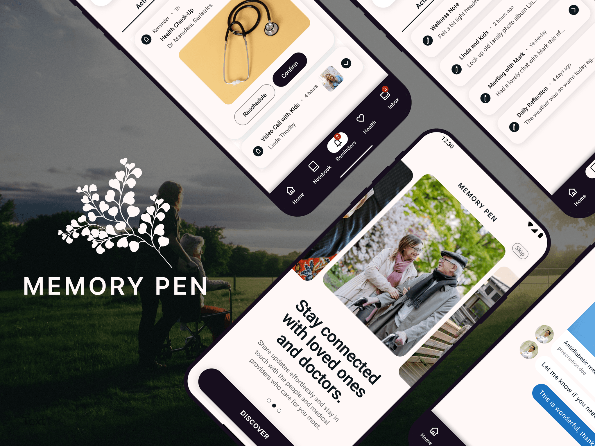
Empowering older adults to stay organized, connected, and independent with intuitive IoT technology with memory support.
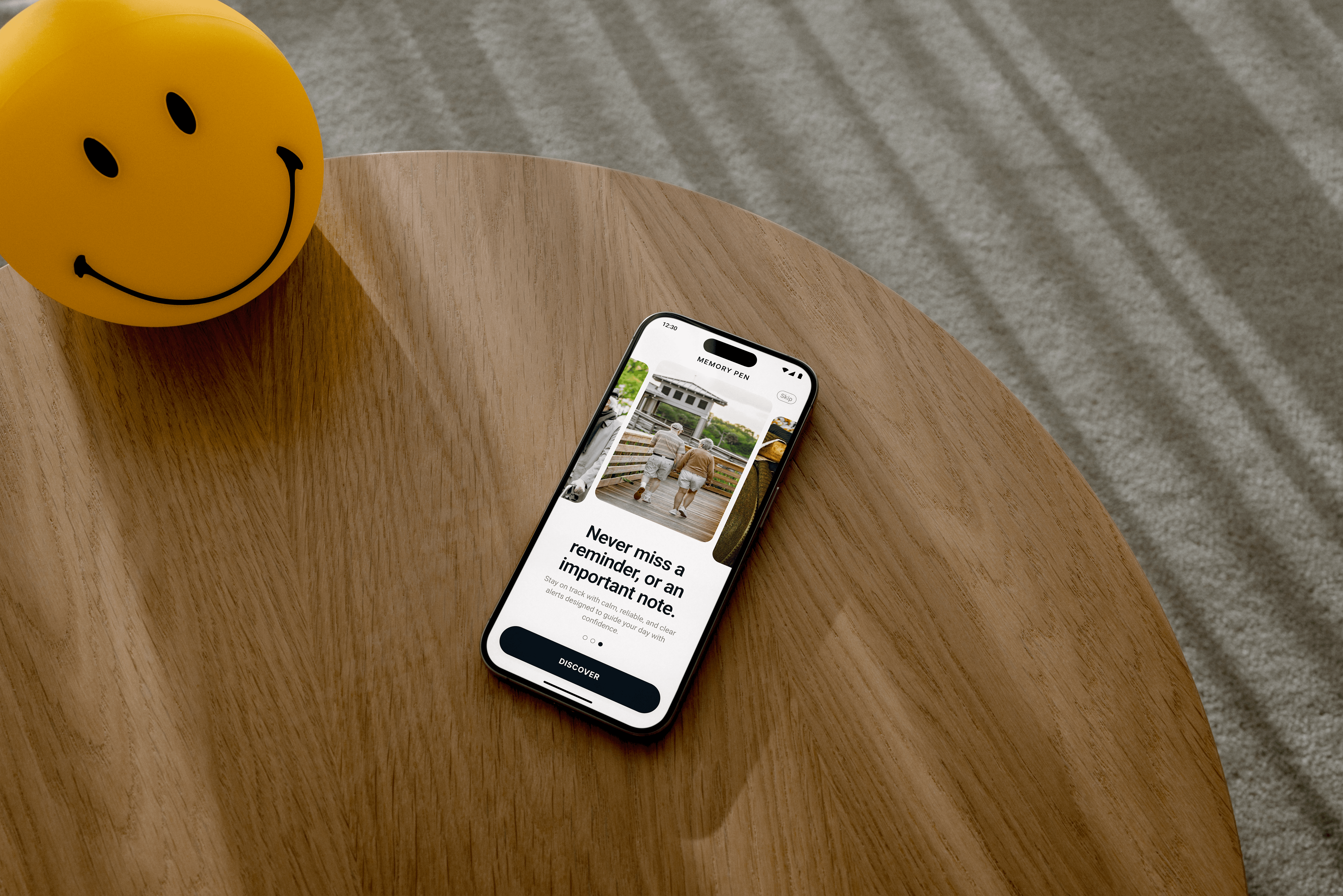
Memory Pen is a connected system for older adults with early-stage dementia, pairing a smart pen and notebook with a mobile app. It transcribes handwritten notes, organizes reminders, tracks wellness, and keeps family and care providers in the loop.
The design centers on accessibility and dignity, using simplified navigation and a calm, low-effort interface to help people stay independent rather than managed.
This case study covers the research, strategy, and UX decisions behind it, from expert interviews through an accessible component system.
Canada is facing a rapid rise in dementia, straining a system with limited support for older adults.
Context: Dementia affects memory, thinking, and the ability to manage daily life. In Canada, the number of people living with it is expected to rise more than 68% over the next twenty years, straining families, caregivers, and a healthcare system already at capacity.
Problem: Many older adults lack reliable support for the everyday tasks that keep them organized and independent. The gap between what they need and what the system can provide points to a clear need for practical, daily solutions.
Solution: A simple IoT system that turns handwritten notes into organized reminders, helpful insights, and secure communication, giving older adults everyday support while keeping them connected to family and care providers.
Using expert research and empathy-driven methods to uncover the true needs of older adults and their care network.
To ground the work, I combined academic literature with conversations with Dr. Amy Hwang, a PhD researcher at the Institute of Geriatrics in Montreal, whose expertise shaped how I understood the way dementia affects communication, emotional stability, and daily routines.
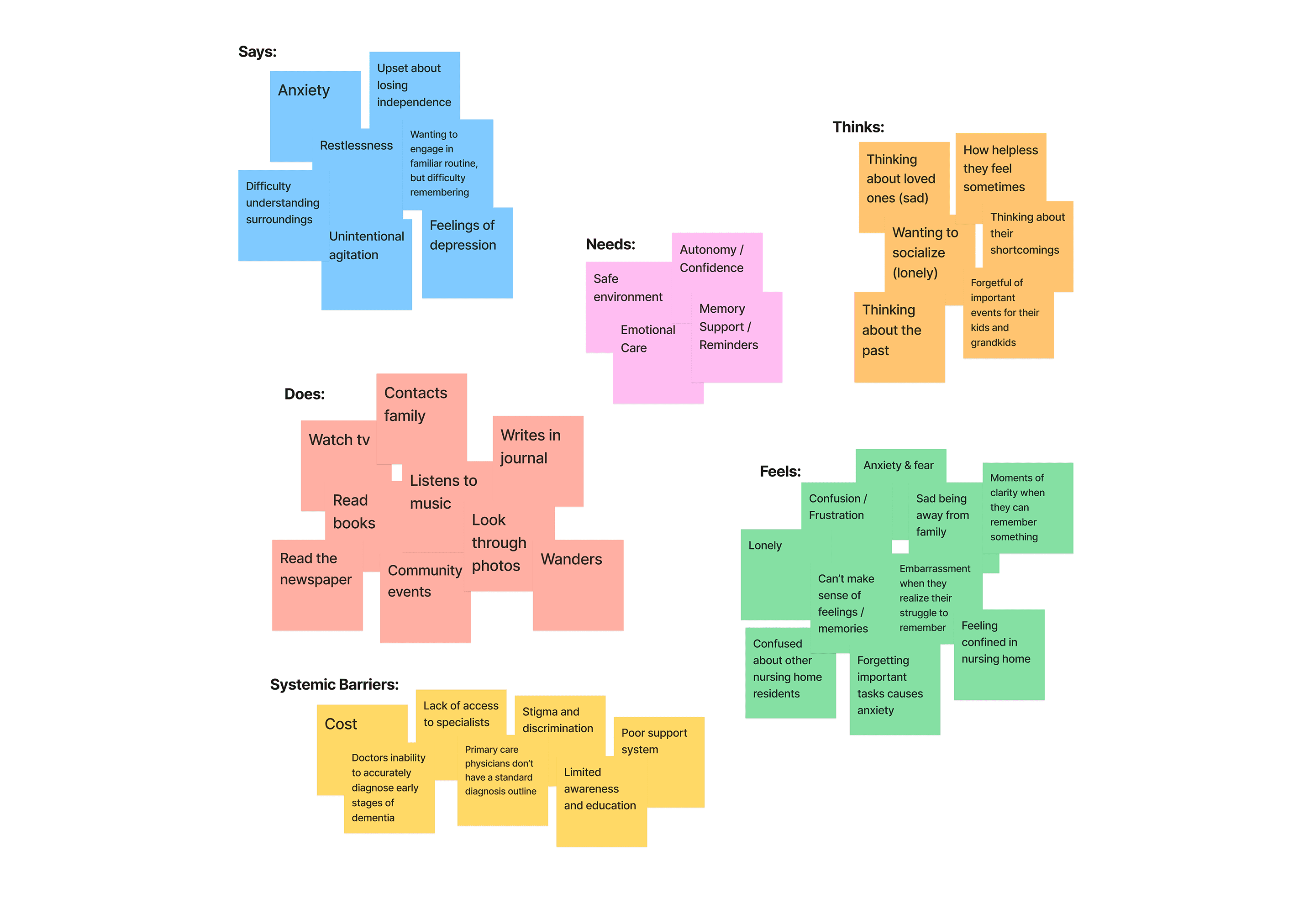
These insights informed an empathy map that surfaced recurring themes: fluctuating cognitive states, reliance on familiar activities, and frequent feelings of confusion, loneliness, and anxiety.
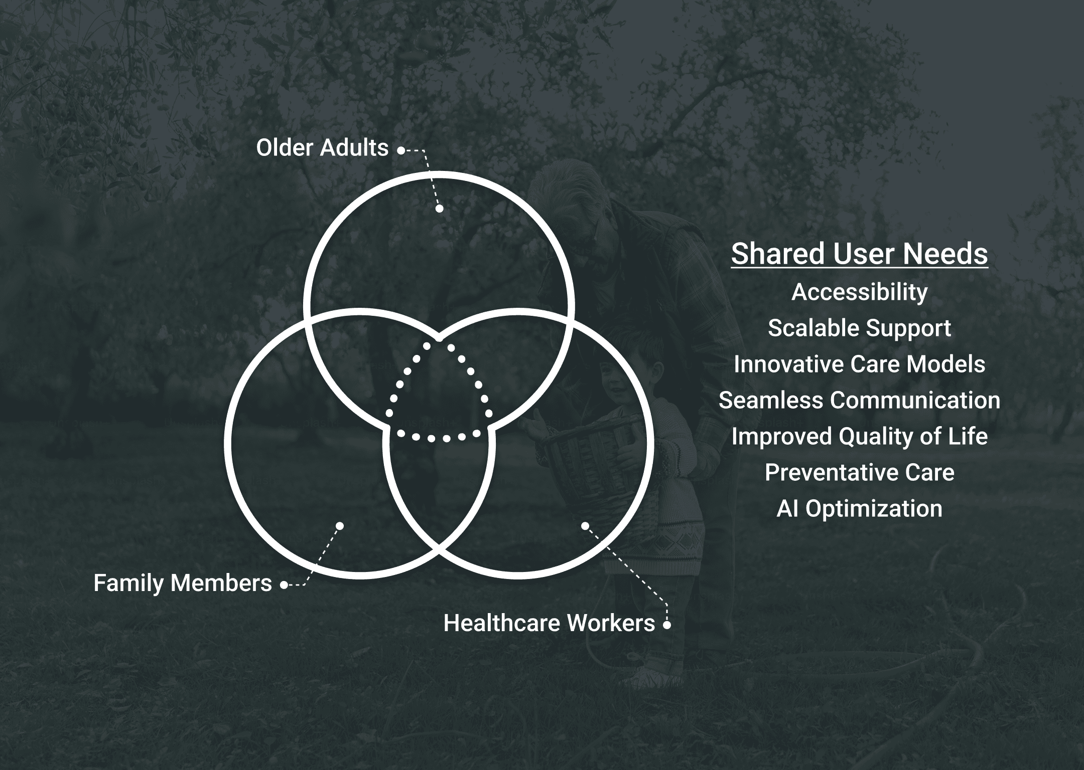
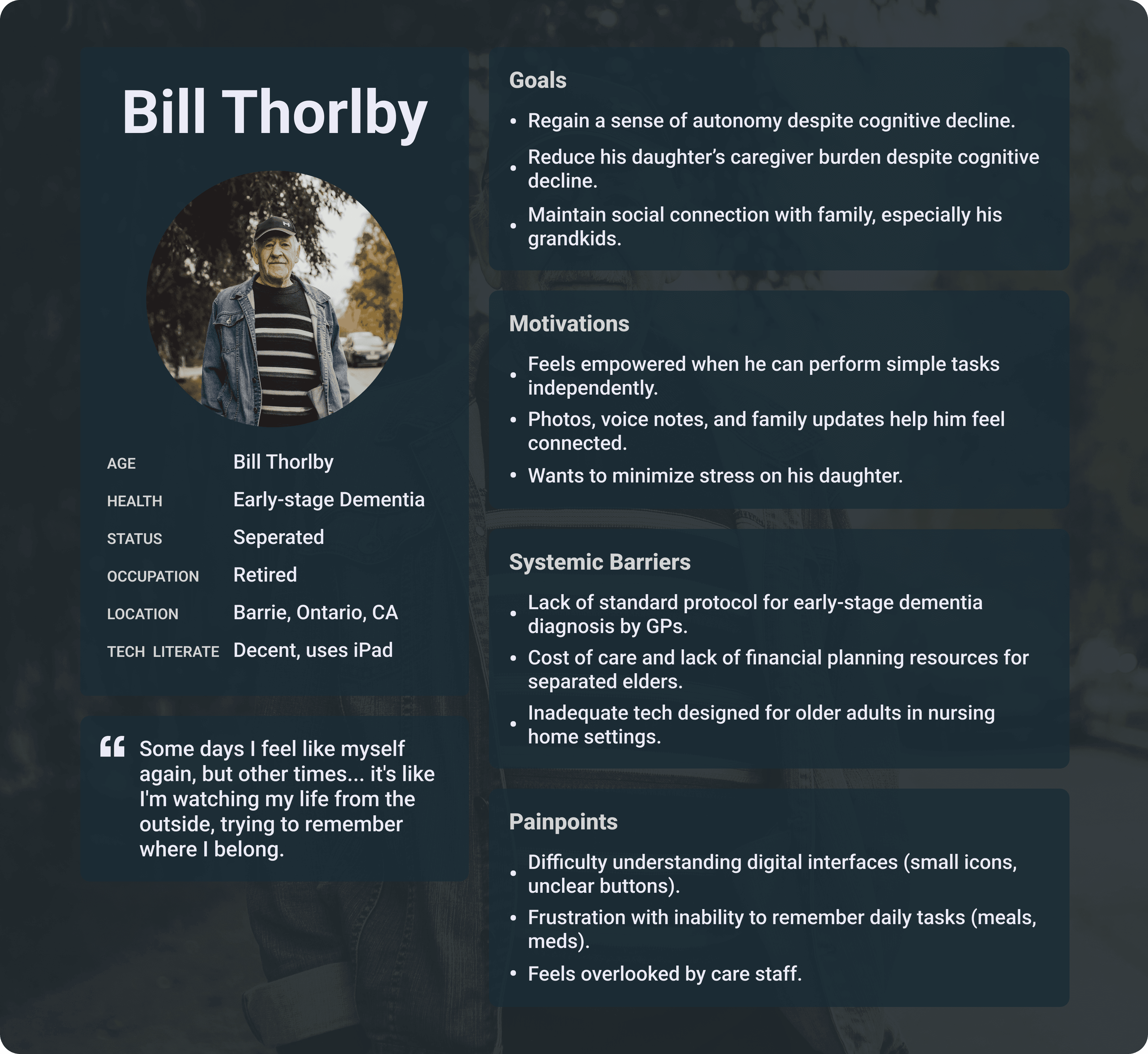
Mapping those themes across older adults, caregivers, and healthcare providers gave me a clearer picture of their shared goals, their pain points, and the gaps in the current system.
From there I moved into accessibility, working from WCAG guidelines and Material Design 3 standards, and built personas for my primary, secondary, and tertiary users.
Turning research insights into actionable design opportunities through 'How Might We' statements.
After defining my users and their needs, I developed a set of 'How Might We' statements to guide early exploration and identify meaningful opportunities within the concept.
I also considered the value of analogue familiarity, recognizing that blending handwritten routines with digital support could help older adults feel more confident and reduce the learning curve when using new technology.
My 'How Might We' statements focused on designing gentle, intuitive reminders, enabling caregivers to support routines remotely, facilitating secure and meaningful communication between families and doctors, and ensuring that every touchpoint across mobile and desktop remained accessible and emotionally reassuring.
Translating research and user insight into accessible, inclusive UI decisions.
With my empathy map, research findings, and 'How Might We' statements in place, I moved into exploring how these insights would translate into concrete UI and usability requirements for older adult users.
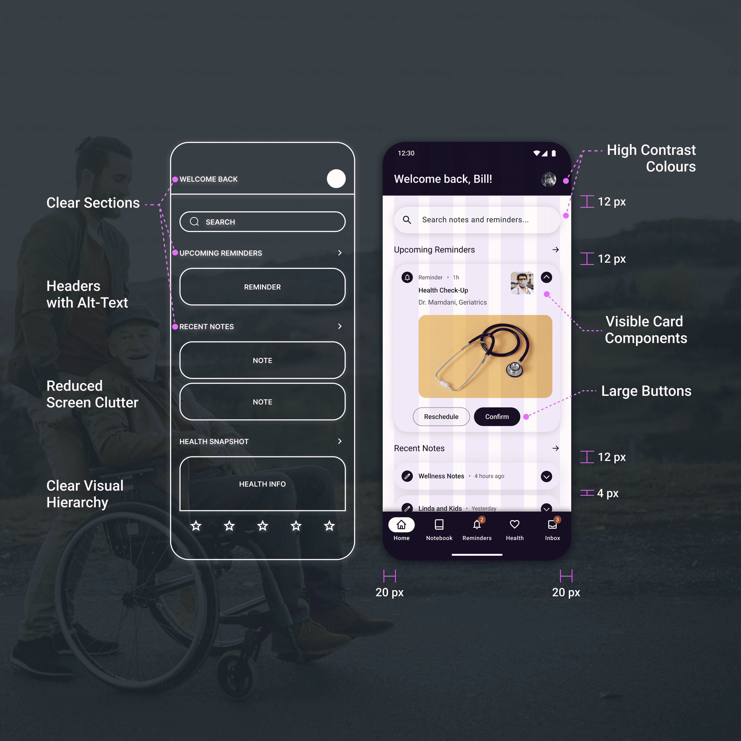
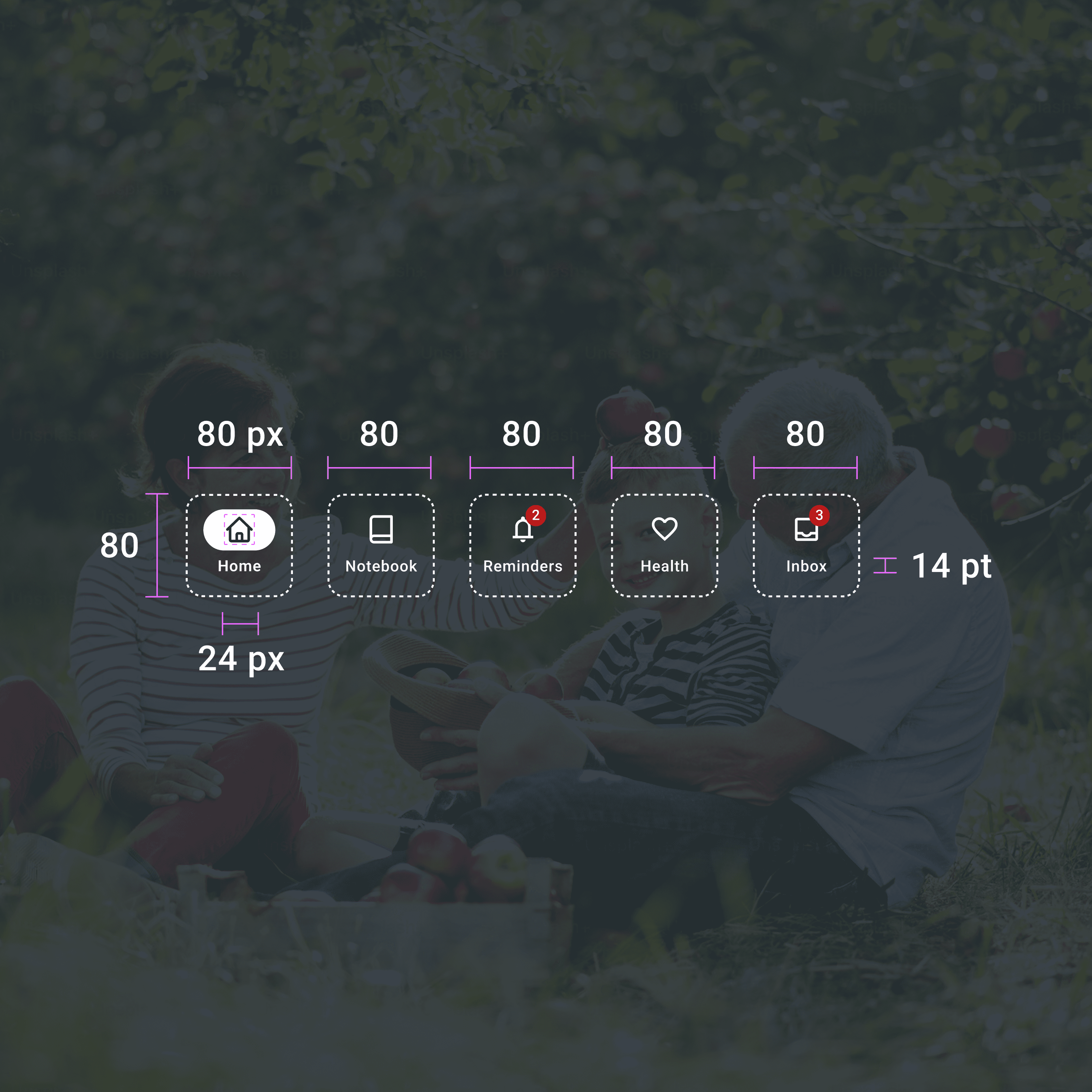
I reviewed WCAG accessibility guidelines and Google Material Design 3 standards to understand best practices for mobile accessibility, focusing on appropriate button sizing, generous spacing between elements, high color contrast, reduced visual clutter, and clear use of headers and labels for assistive technologies.
Crafting wireframes for a more focused, high-clarity experience with accessibility at its core.
My next step was to translate these accessibility principles into a simple, easy-to-navigate interface with a clear visual hierarchy. I avoided scrolling carousels and off-screen elements that could confuse older adults, and instead focused on large buttons, clear navigation, and spacious card components that felt predictable and easy to tap.
Consistent spacing and a high-contrast color palette ensured readability while minimizing cognitive load. I kept the dashboard intentionally minimal, showing only essential information such as urgent reminders, recent notes, and a health snapshot to reduce mental overwhelm.
Throughout the process, I relied on the Google Material Design 3 design system to maintain consistency and uphold accessibility standards, ensuring buttons met the minimum 44-pixel touch target and text remained at least 14-point for legibility.
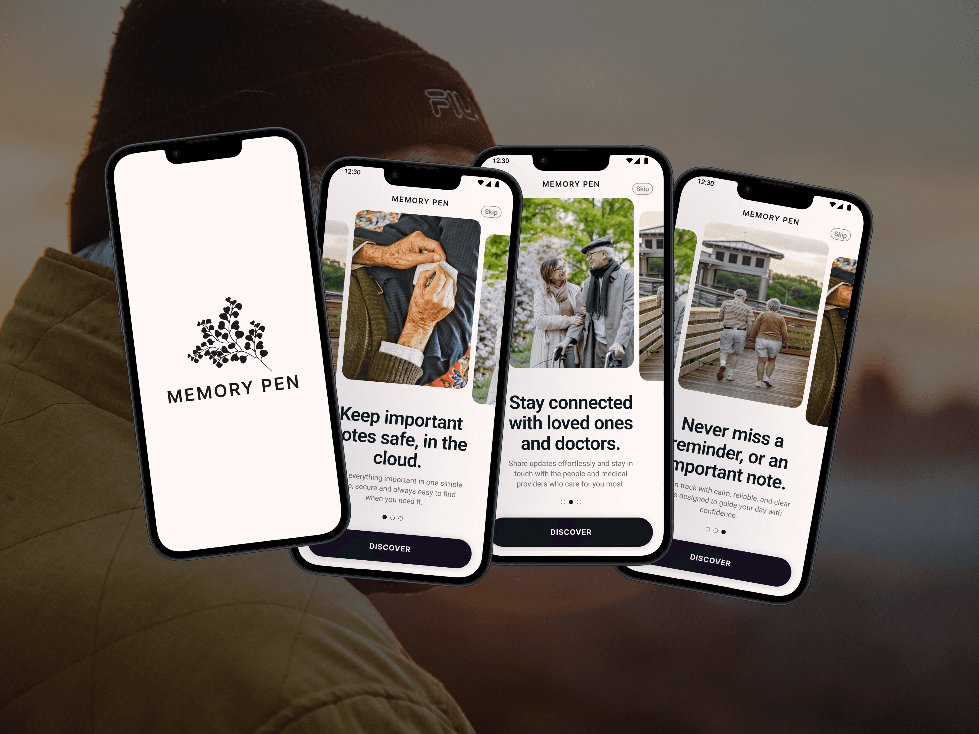
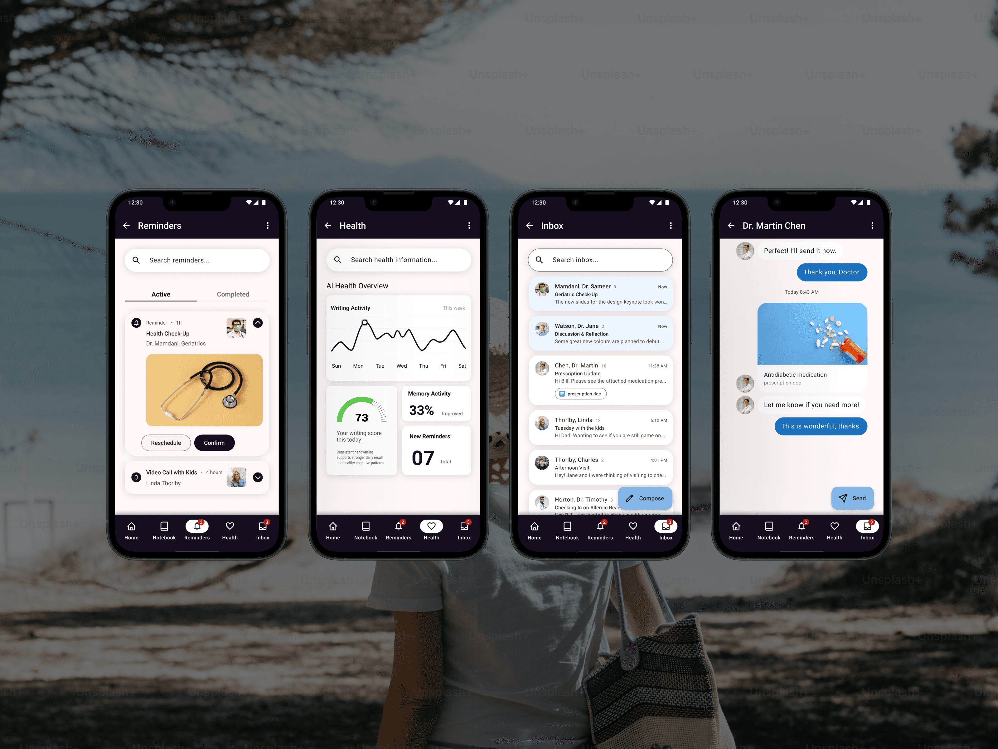
This final design shows how smart, accessible technology can transform handwritten notes into easy reminders and meaningful support.
The final concept, Memory Pen, brings together an intuitive smart-pen and notebook that capture handwritten notes and reminders and securely transcribe them to the cloud. Users can access their entries through a simple mobile or desktop app, supported by AI that organizes information and delivers helpful reminders.
The familiar analog experience offers seniors comfort and autonomy, while advanced machine learning analyzes writing patterns to provide caregivers and doctors with meaningful insights into cognitive changes over time. The final screens showcase a clean, accessible interface designed to keep seniors connected, informed, and confidently in control of their daily routines.
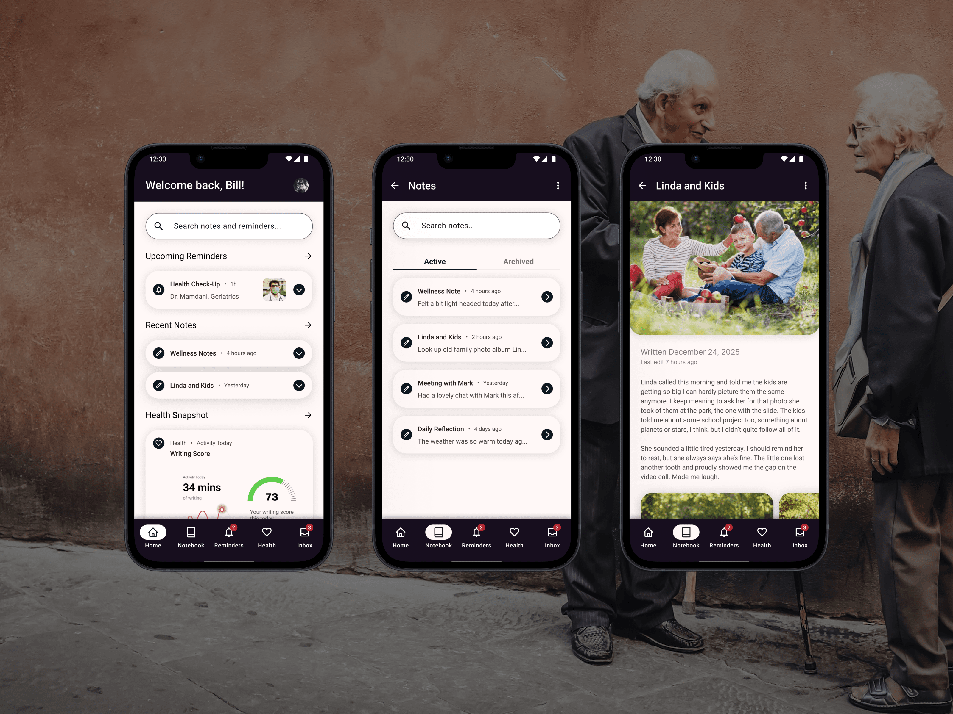
A thoughtful step toward more accessible, supportive technology for aging populations.
This project taught me the value of designing with empathy at the core, pushing me to deeply understand the daily realities of seniors and the people who support them.
It also reinforced the importance of inclusive, accessible design, showing how thoughtful decisions can create technology that feels comfortable, supportive, and genuinely empowering for diverse users.
What I learned:
• Empathy-driven design: The importance of deeply understanding seniors' unique needs, emotions, and challenges.
• Iterative problem solving: Gaining experience refining ideas through feedback and expert insight.
• Designing for diverse needs: Learning how to balance the priorities of seniors, caregivers, and medical professionals.
• Prioritizing inclusivity: Using personal experience and research to ensure accessibility and dignity remain central to every design decision.