Hydro Cool
A rebrand of Hydro Cool Systems, combining strategic research and visual design to create a cohesive identity for a clean logistics company powered by hydrogen technology.
Project Type:
Brand Identity
Focus:
Branding, Visual Design
Context:
Client Project
Date:
Aug 2023

Rebranding a hydrogen-powered cold transport company, dedicated to delivering fresh produce through clean energy.
Hydro Cool is pioneering the future of sustainable cold transport through hydrogen-powered refrigeration systems.
As a designer, my goal in rebranding was to create a visual identity that reflects the company’s innovative technology, environmental mission, and growing role within Canada’s clean energy landscape.
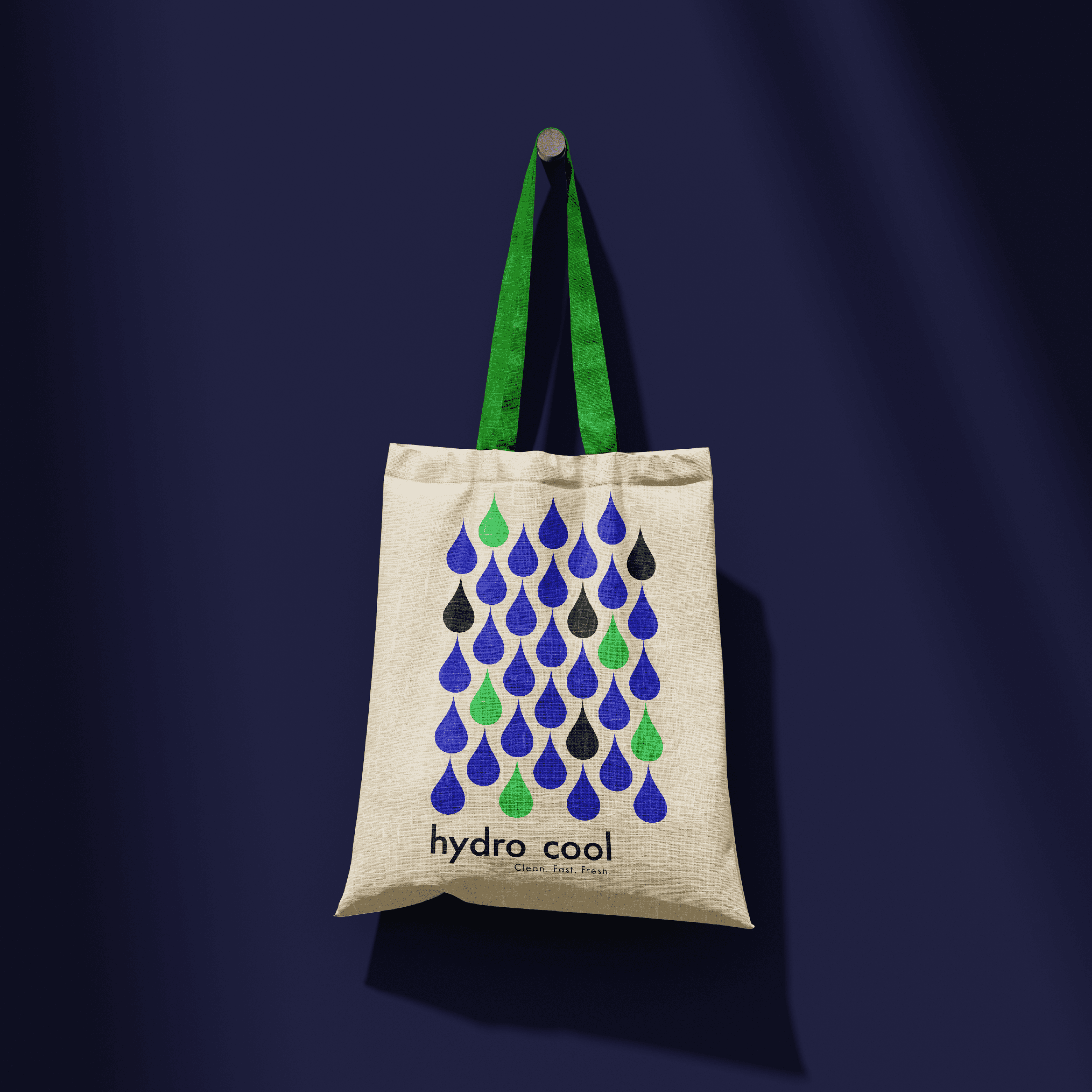
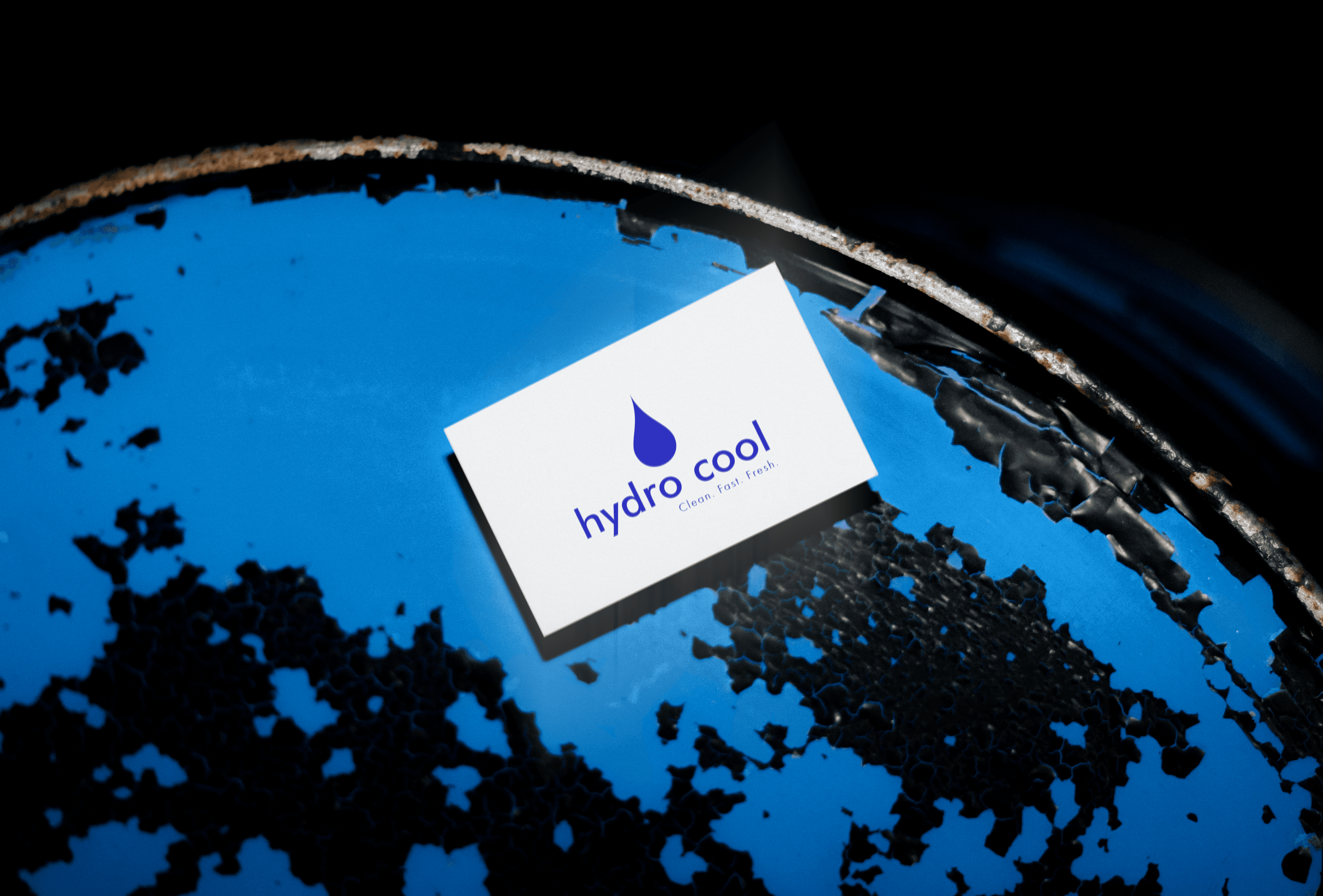
The new logo captures the purity and efficiency of hydrogen power while presenting a professional, memorable, and future-forward brand suited to both the tech and logistics sectors.
This new brand identity positions Hydro Cool as a leader in sustainable cold chain logistics, embodying clarity, innovation, and impact.

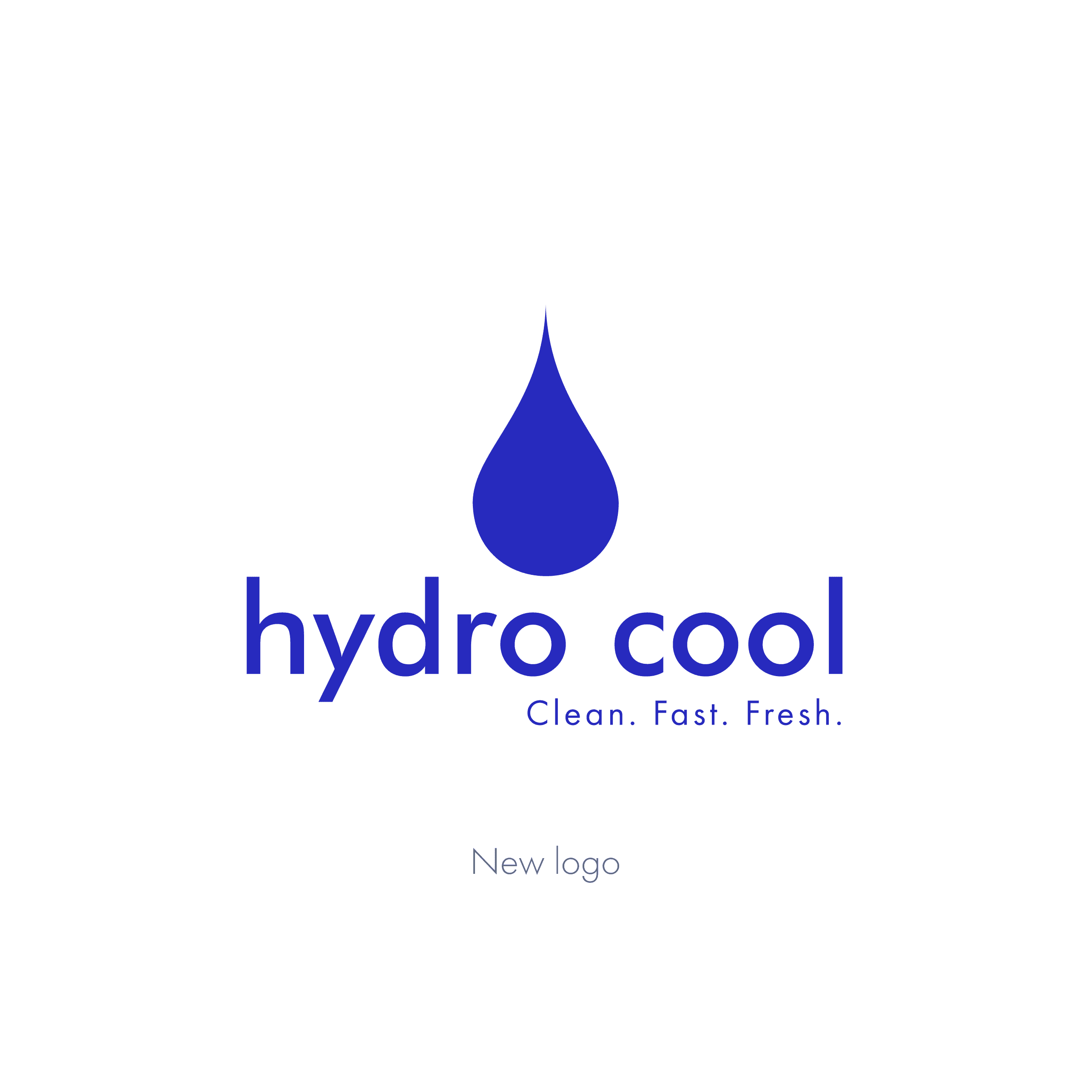

Creating a clean, yet impactful logo that captures the essence of water and energy.
The inspiration behind Hydro Cool’s new logo came from the core of their technology: clean hydrogen power that emits only water.
I chose a simple, modern water droplet as the primary symbol to create a logo that’s instantly recognizable, versatile, and meaningful.
The droplet represents both the purity of their zero-emission energy and the freshness of the produce their technologies help deliver.
The spacing between the two elements uses half the width of the water droplet when split vertically to maintain consistent negative space and a clean, modern structure.

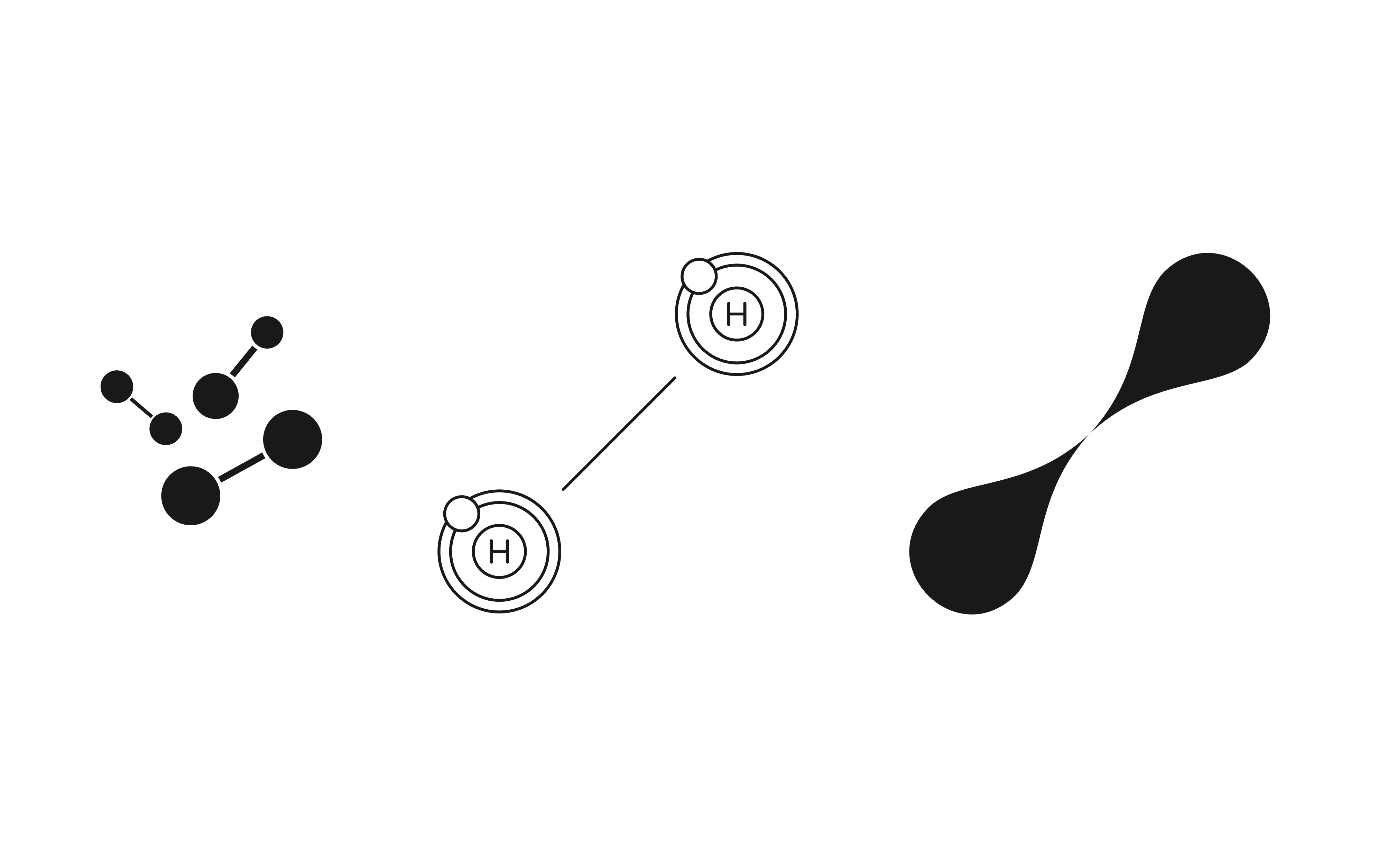
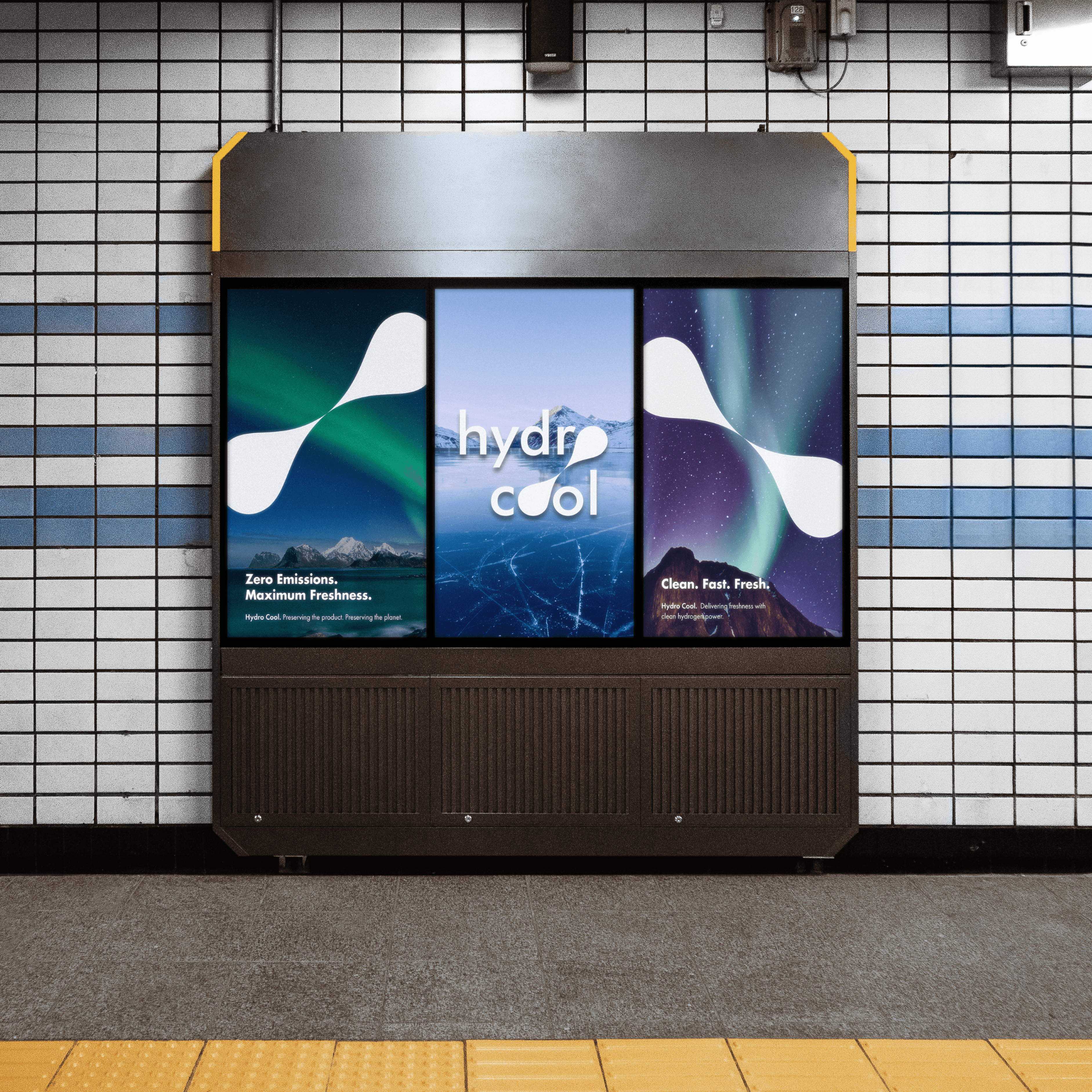
The visual structure of the logo subtly forms a hydrogen molecule, tying the identity back to its energy source.
The secondary logo builds on the same clean energy narrative by featuring two water droplets joined at their points, symbolizing the (H₂) molecule at the heart of Hydro Cool’s technology.
The paired droplets offer a versatile alternative mark that communicates both sustainability and technological sophistication in a clear, memorable way.
This simple design nods to the science behind hydrogen power, visually representing two hydrogen atoms coming together.